
Bluente
Business language learning app

Overview
Bluente is an early-stage start-up providing a language learning application, targeted at individuals who wish to improve their business language skills. Bluente does that by providing a wide range of course selections, with industries-specific topics tailored for the users.
ROLE
Working in a team of 4, as the UI/UX designer, and lead researcher, together with a graphic designer, front-end developer, and product manager.
DURATION
1 month (October – November 2021)
The problem
At this point, Bluente was in the process of developing the beta version of the app. We were a few more weeks before the final app launch and we aimed to do final testing of our product before launching the app. Previously, we had conducted heavy research on the content and learning effectivity of our app’s main features. However, we never tested the flow of the overall app.
Hence, the purpose of this study was
to clarify and identify problems that may occur when the users use the app before it is officially launched to the market.
We also want to learn the behavior and the journey that the users had while using the app while identifying any roadblocks or issues in the app itself.
Goal of the study
The goal of this study is to:
-
To learn users’ behind the scene process while using the app and their learning journey
-
To identify any problems and frustrations that the users have while using the app
-
To learn the effectiveness and efficacy of our modules in teaching the languages in 2 weeks time
Usability testing
To answer the questions that we have and to identify any UX issues, we started by conducting usability testing with 9 representative users who are working professionals and students with basic Chinese language capabilities. The age groups range from 20 – 40 years old, representing our target users.
We began the usability testing by identifying the what, why, who, when, where, and how in conducting this user research. We decided to conduct two weeks long observation on how the users use the app. Here’s how we conducted the research:
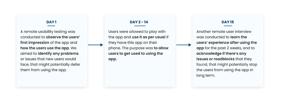
On our usability test, we conducted a remote user testing with 9 representative users. I gave them scenario-based questions that the users have to do:

Based on our testing, we discovered many issues that could be major frustrations and roadblocks for the users.
Besides the smaller UI problems, the main problems that the users felt was that
the flow of the app was not clear and straightforward.
There weren’t any indications of where they should go to (the CTAs were not clear), nor any information that can help users to make further decisions. They also have to do a lot of clicking to get into the main features of the app itself which make the app less efficient.
Brainstorm
After receiving the first usability testing results, we directly gathered as a team to conduct a brainstorming workshop. We began by creating a partial flow that the current users have to go through in order to access the course.
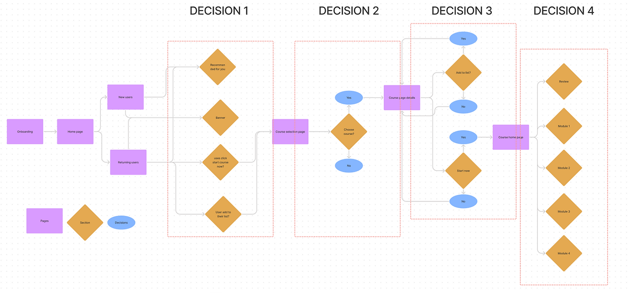
To get into the core of the app, the users have to take a total of 4 steps. Since our targeted users are busy working professionals or students that are progressing to their career lives, adding steps means more time spent. Hence, we started out by brainstorming on
how might we provide a more straightforward flow for the users, while giving clearer prompts on what to do while using the app.
Solutions
To solve the problems, we came up with these different solutions:
1. Reduce the steps taken to get to the main feature of the app to save more time


2. Provide a clearer instruction of where the users have to click by giving recommendations of courses for them. We tried to utilize the answer to the preliminary questions in the onboarding to suggest the courses that best fit the interests of our users.
3. Give more personalization to the app, to increase the users’ trust while helping users to decide which courses best suit their preferences


4. Provide clearer CTAs to help users identify and distinguish which part can be clicked and which cannot
5. Provide more information to help users decide which courses to take

Results
After it was implemented, we received a lot of positive feedbacks from the users in the final interview. They were able to use the app more smoothly as it is now clearer where they should go to.
At this point, we haven’t launched the product yet. However, I will update the results once the app is live.
"The new home page is more actionable because of the start button and the recommendations. It’s much cleaner and it’s easier to navigate"
"I love the information provided. It is sufficient to help me decide to choose courses. It also has more space which is nice."
Moving forward
To improve the product, more actions are needed, which include:
-
Conduct more topic-specific research on certain pressing issues in the app and brainstorm solutions to solve them
-
Measure the analytics of the product after launch to gather some trends and to pinpoint any undesired changes and hence, identify early problems
-
Gather more data and conduct more user interviews with our users to better understand the needs of the users and provide the best solutions for our users
Reflection
It was relatively a brief project, but it had been a fruitful one. I learned tons of good things from the experience.
-
Never assume things, test them with users
When it comes to product design, we are always solving problems for the users. As a designer, we are often biased since we’re the ones designing for it. Hence, the only way we know whether our product works well or not is by seeing how our users interact with the product and learn from it.
-
Collaboration makes perfect
By working with other people from different teams can bring in new perspectives and ideas. When it comes to solving a solution, we always have limited knowledge. However, when it’s combined, those limited knowledge becomes more powerful in providing the best solutions to the users.
-
No UX projects will be the same
Depending on the problem that the users face, the scope of the project will always change. It’s important to remember that there are a lot of other external factors, other than users’ needs. Here, as a designer, we are forced to adapt to the situations.